

Antenna TV Rebrand
Antenna TV evokes the era of fidgeting with bunny ears on your television and your favorite show magically coming into focus. For the past 10 years, the network has been airing reruns of classics from the 1950s to 1990s: everything from Father Knows Best to Family Ties.
When Nexstar launched a sister network called Rewind TV with a focus on 80s and 90s sitcoms, there was an opportunity to refresh the brand behind Antenna TV. After a successful collaboration on Rewind TV, we were excited to work with the team at Nexstar to create an identity that better showcased Antenna TV’s offerings.
We delivered a full network refresh, including a logo facelift and on-air graphics elements, from bugs to promo materials. Every design element was created to also be used on social and digital channels, boosting brand cohesion.

The right time to rebrand
This marks Antenna TV’s first rebrand. With such an established identity, it can sometimes be a challenge to embrace a new direction. While the content on the network is timeless, no brand is immune to shifts across design landscape.
We believe it’s best to evaluate a brand’s identity at least every 4 to 5 years. No brand refresh should be considered only because of age, but ignoring changes in the cultural and design worlds can cause a disconnect with audiences.
With the network’s focus on decades and this marking Antenna TV’s 10th year, we all agreed that the timing was perfect to give the network a visual update.
It was crucial to not abandon Antenna TV’s personality or leave behind any of their current fans. Our goal was to evolve the brand to strengthen its presence, attract younger viewers, and plant a stake in the classic television market.

Movin’ on up
Every rebrand that we create starts with strategy. This not only gives our artists ideas for intriguing directions to explore, but it also ensures that any design we create furthers the brand’s overall goals and mission.
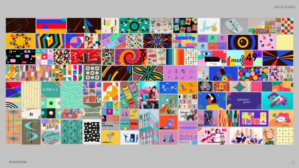
A well-thought through design strategy starts with research. We did a thorough analysis of the competition in the classic television market: 9 networks in total. We broke down each competitor’s visual identity, color pallettes, and motifs to identify trends in this vertical, as well as tropes to avoid.
Antenna TV offers five decades worth of content. One of our biggest challenges was figuring out a direction that felt appropriately retro, yet modern and fresh. We also wanted to evoke those different eras of television without pinning the look to one specific time period.
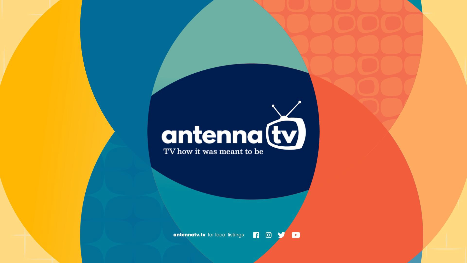
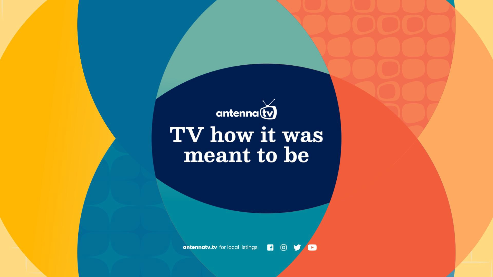
To create a timeless feel, we went in a direction that embraced bright colors and simplicity.

TV at the heart
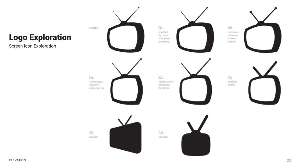
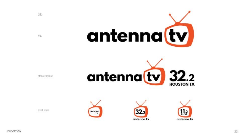
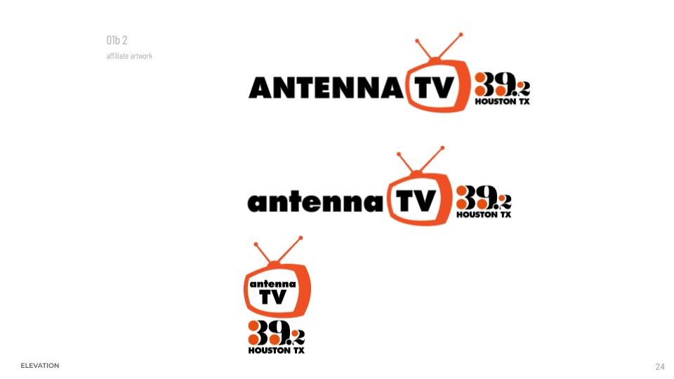
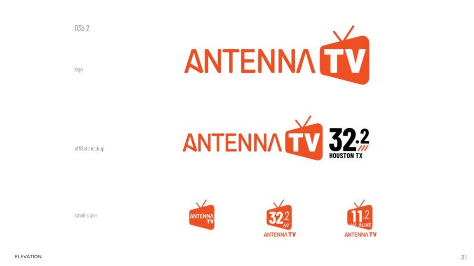
A logo is important for any rebrand, but it proved especially crucial for this project. Our artists landed on a design direction that put the shape of the logo at the center, playing with the outline and silhouette.
We didn’t want to completely reinvent Antenna TV’s existing logo. The TV with an antenna on top icon conveys exactly what the brand is all about. But our artists gave the logo a brand new look.
We did many iterations of logo explorations to find the right shape that both felt fresh and supported the silhouette concept.


Bewitching colors and patterns
We created a brand palette that embraces bright colors. This not only evokes a retro feel, but it also gives the brand a young, welcoming vibe.
Our artists also used patterns to help the design span over several decades. So the network can pair its programming with an era appropriate pattern, such as using a mid-century design alongside Bewitched.


Classic content, modern advantages.
Besides gaining a fresh, attention-grabbing look, rebrands have additional advantages. Technology always races ahead, and there have been huge advancements in After Effects toolkitting since Antenna TV’s branding was created.
We were able to create the network package in a way that creates more efficiencies and allows departments to collaborate better. In the long run, this saves Antenna TV’s internal team time and money as they implement the new look.
Another goal of this rebrand was to give the team at Antenna plenty of options. The color palette expands upon the brand’s iconic warm orange color with a range of complementary cooler hues. The team can also mix and match patterns to create unique combinations for their programming.
To offer even more flexibility, we created four End Page templates that provide different combinations of text, photography, and footage.


A dream come true…
We had a blast collaborating with the teams at Nexstar Media Group and Antenna TV. We are thrilled with how nifty, groovy, dope, and rad this project turned out.
Credits
Client: Nexstar Media Group / Antenna TV
Executive Creative Director, Nexstar Media Group, Inc.: Dan Brown
Manager, Creative Services, Nexstar Media Group, Inc.: Corey Scarborough-Blaskovich
Production Company: Elevation
Executive Creative Director: Stephen Cocks
Art Director: Dianne Frisbee
Executive Producer: Steph Carson
Director of Strategy: Brett Rakestraw
Sr. Designer / Artist / Animator: Kito Kondowe
Designer / Artist: Leo Franchi